
The majority of the work I do is for digital, but when it comes to local community activations like Seawheeze, or pushes into underexposed markets like Ontario, Calgary, and Quebec, print is often needed to gain that sense of physical presence.
Below I’ve featured a few examples of the varying types of print work I’ve done over the years — from PR booklets to billboards, and everything in-between.
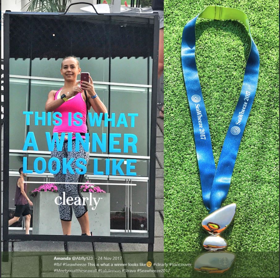
Winner’s circle
For Seawheeze 2017 we had a booth at package pickup that gave people a little more time to engage with the brand — from temporary tattoos to massages, we wanted people to stick around our tent a little longer and get to know Clearly. One of the biggest hits at the event was this mirrored lunch board sign that let people pre-brag on Instagram before the race. Many photos like this were the result, which was a big hit for social interaction:
Imagination station
Similarly, we showed up at the Woodwards Building atrium for World Sight Day 2017 with a huge optical illusion. The following lunch board sign sat outside the building encouraging people to come in and have a look:

The post
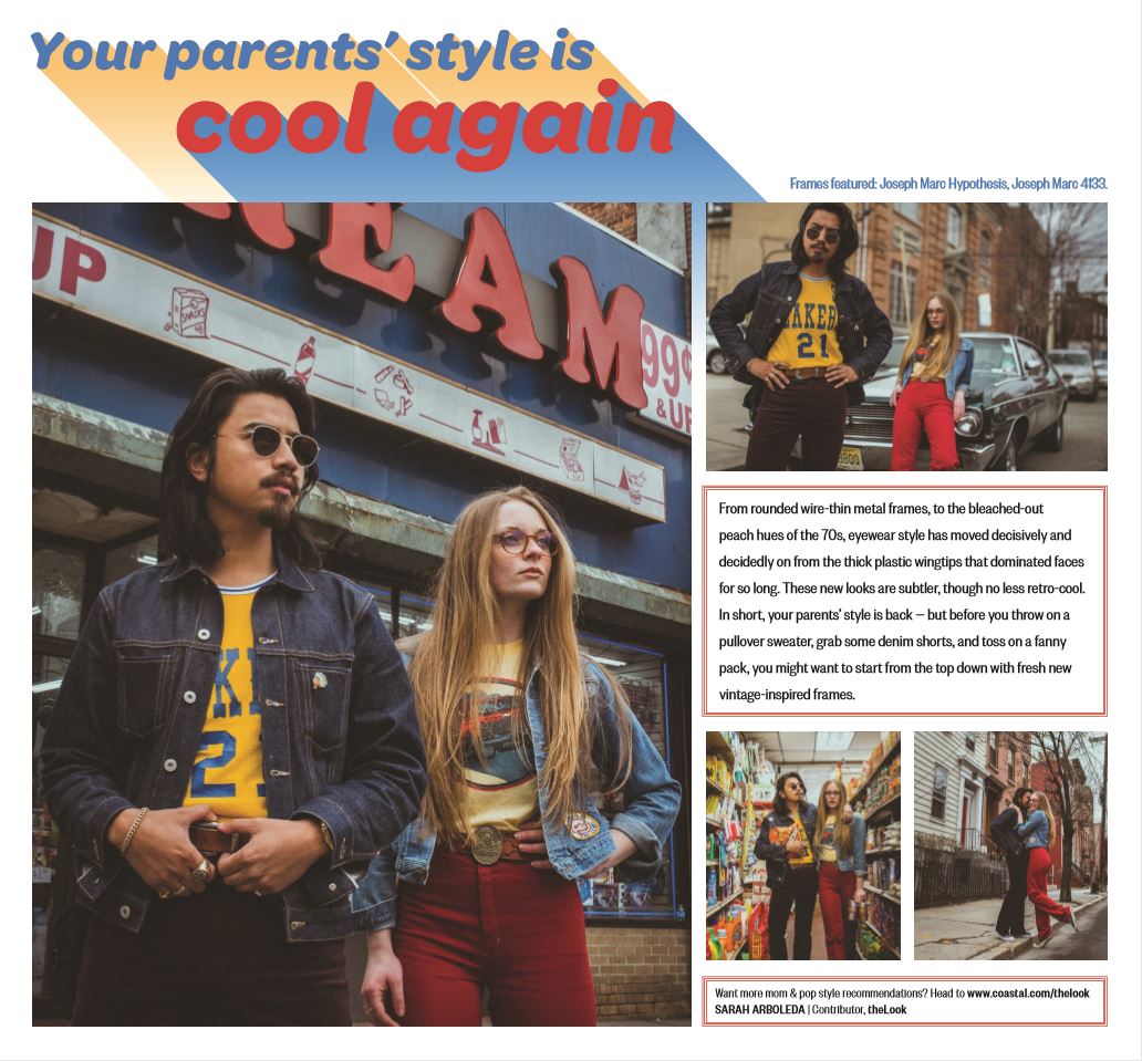
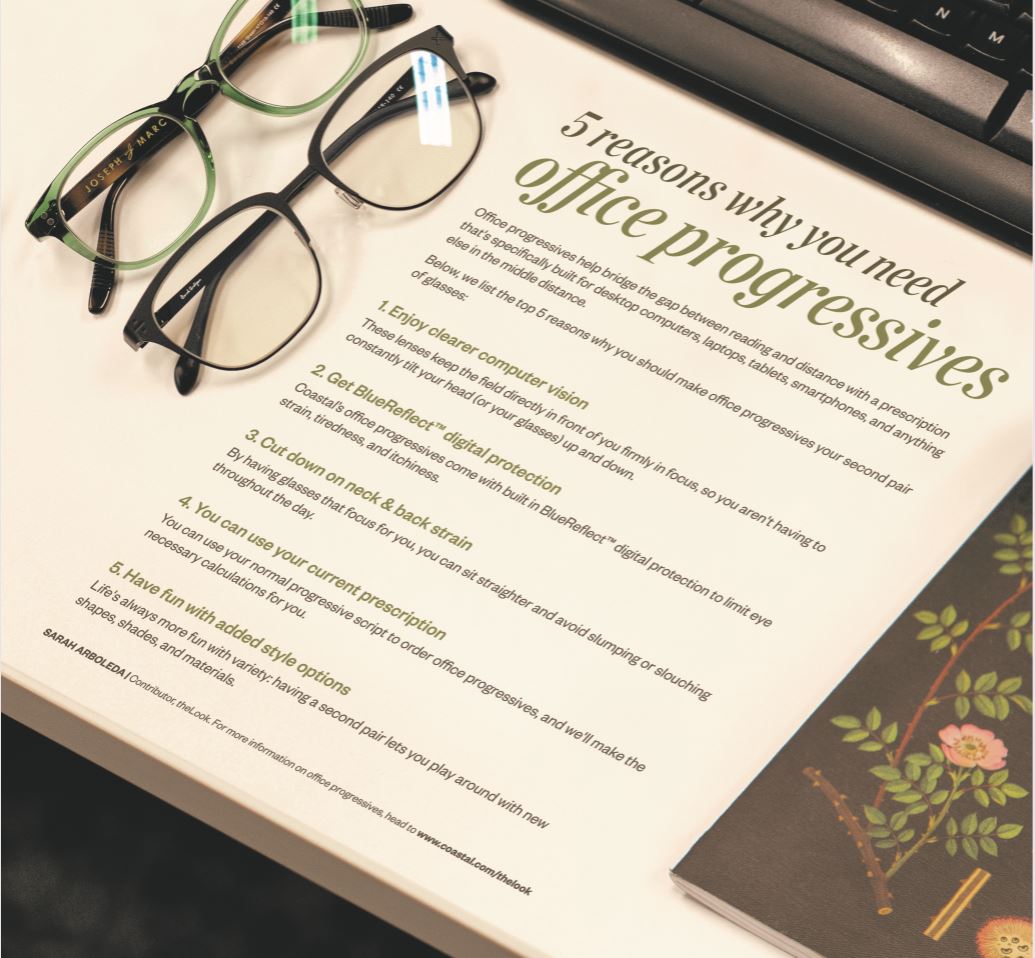
For three years, we contributed a weekly editorial page to the Washington Post’s weekend edition. The purpose alternated between purely brand and educational. Below, I have one of each — showing the way that we promoted new trends or helpful fit or prescription tips to readers who may not otherwise have interacted with us online, or been aware of the ease of online shopping:
Required reading
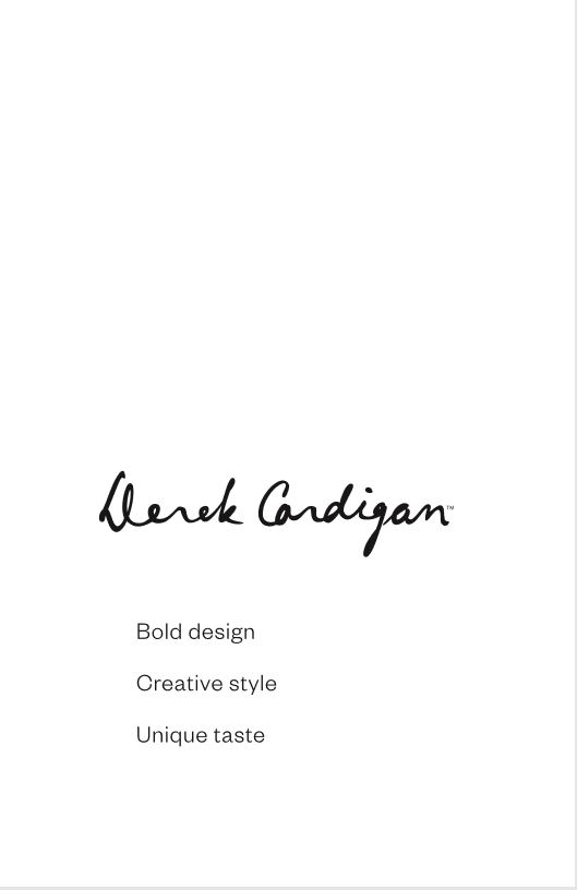
Last year we made a big push toward having a roster of influencers who would regularly wear our glasses and promote our brand. To keep them on the same page and to make sure that they were aligned with our message, our history, and our products, we sent out printed brand books. The goal was to inform, but not overwhelm, and to give a quick snapshot of our individual product lines, including Derek Cardigan. Below is just a sample of the information and brand stories that we included:


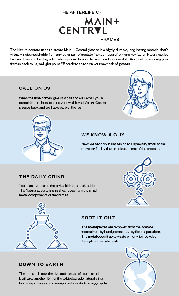
It’s easy being green
We launched a brand-new glasses line in 2017: Main + Central, for which I came up with the line’s name, and the messaging surrounding its biodegradable acetate frames and universal style. The purpose behind the brand was to offer our most popular shapes in our most popular colours, while ensuring that everything was fully sustainable. The card and infographic below were sent out to influencers and customers to help promote these key messages in an easily-digestible format.

Thank you for having a look!
